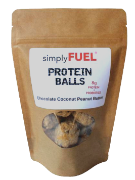
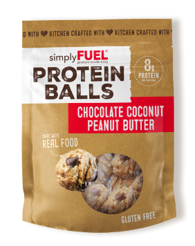
img before
img after
Challenge

Simply Fuel started in nutritionist Mitzi Dulan’s kitchen and quickly gained popularity with the Kansas City Royals. On the heels of her fast success, Mitzi recognized the need to upgrade from the hand labeled brown paper pouches people had come to love to something the mainstream consumer would trust.

Insights & Strategy

Through thoughtful analysis of the brand and competition, we decided to emphasize the homemade and handcrafted quality of the product. These protein balls are a real showstopper taste–wise, so we set out to take a balanced approach to function and flavor.

Solution

Incorporating the homemade feel, appetite appeal and functional benefits in a balanced and careful way, Simply Fuel’s new packaging leans into their differentiators seamlessly. It is warm, personal, and feels decidedly kitchen-created. The nod back to the original package is tangible, but the new look gives the brand the legitimacy of a supermarket staple. As the brand innovates into new categories, the design system we established effortlessly extends into new product forms and formats- a true sign of a packaging design with longevity.

Results

Since redesigning the packaging, Simply Fuel has seen an increase in national distribution and club store opportunities. They expanded their foodservice footprint with Pressed Juicery and successfully launched two additional product lines.

“Mudge is the best in the business. If you’re looking for THE food & beverage experts, you’ve found them.” – Mitzi Dulan, founder of Simply Fuel

Our team’s role: creative strategy, creative direction, logo and packaging design. A portion of this project was executed while at The GRO Agency.

Connect with us

This site is protected by reCAPTCHA and the Google Privacy Policy and Terms of Service apply.

"*" indicates required fields