How do you tell a big hydration story on the smallest package?
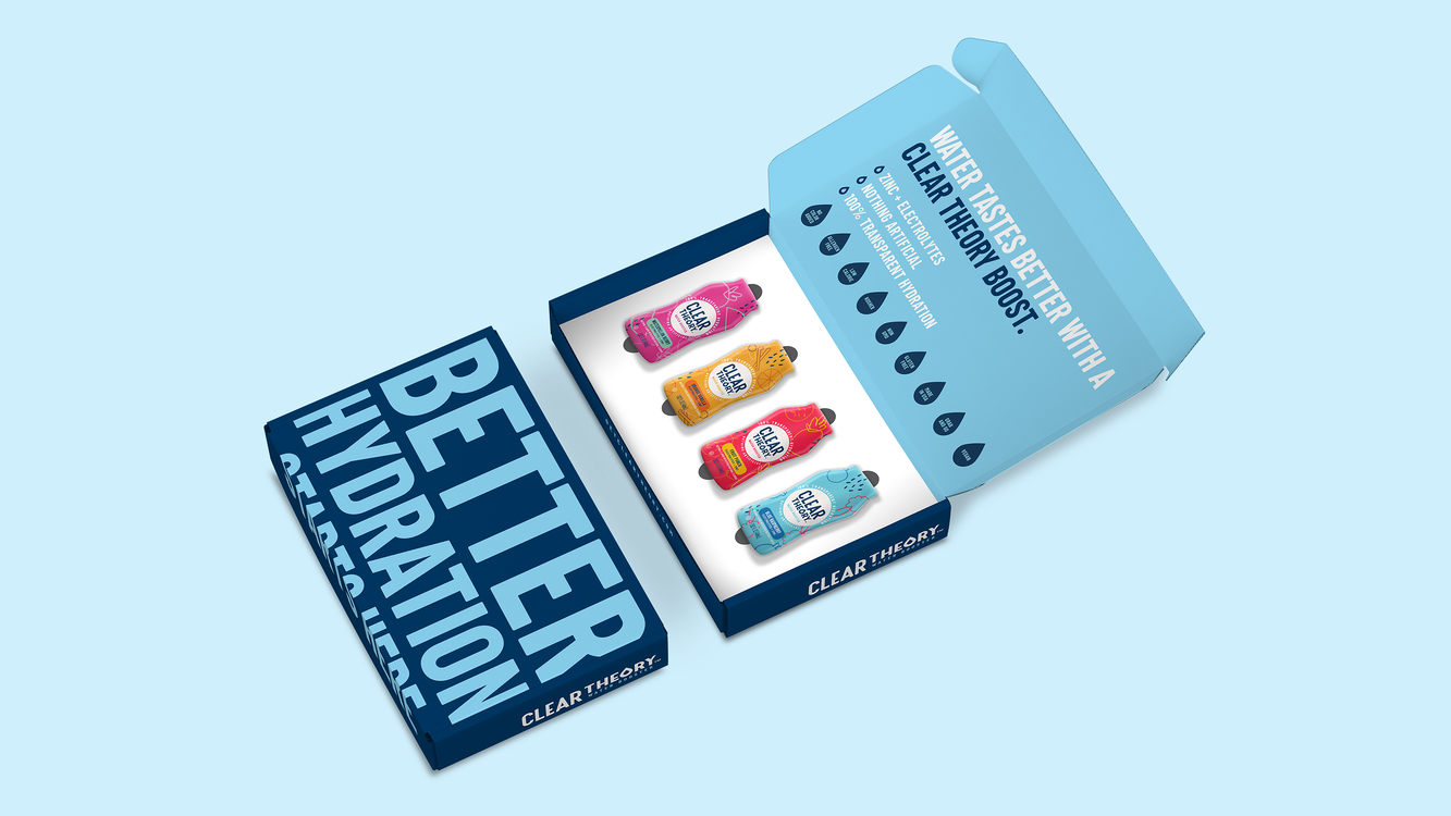
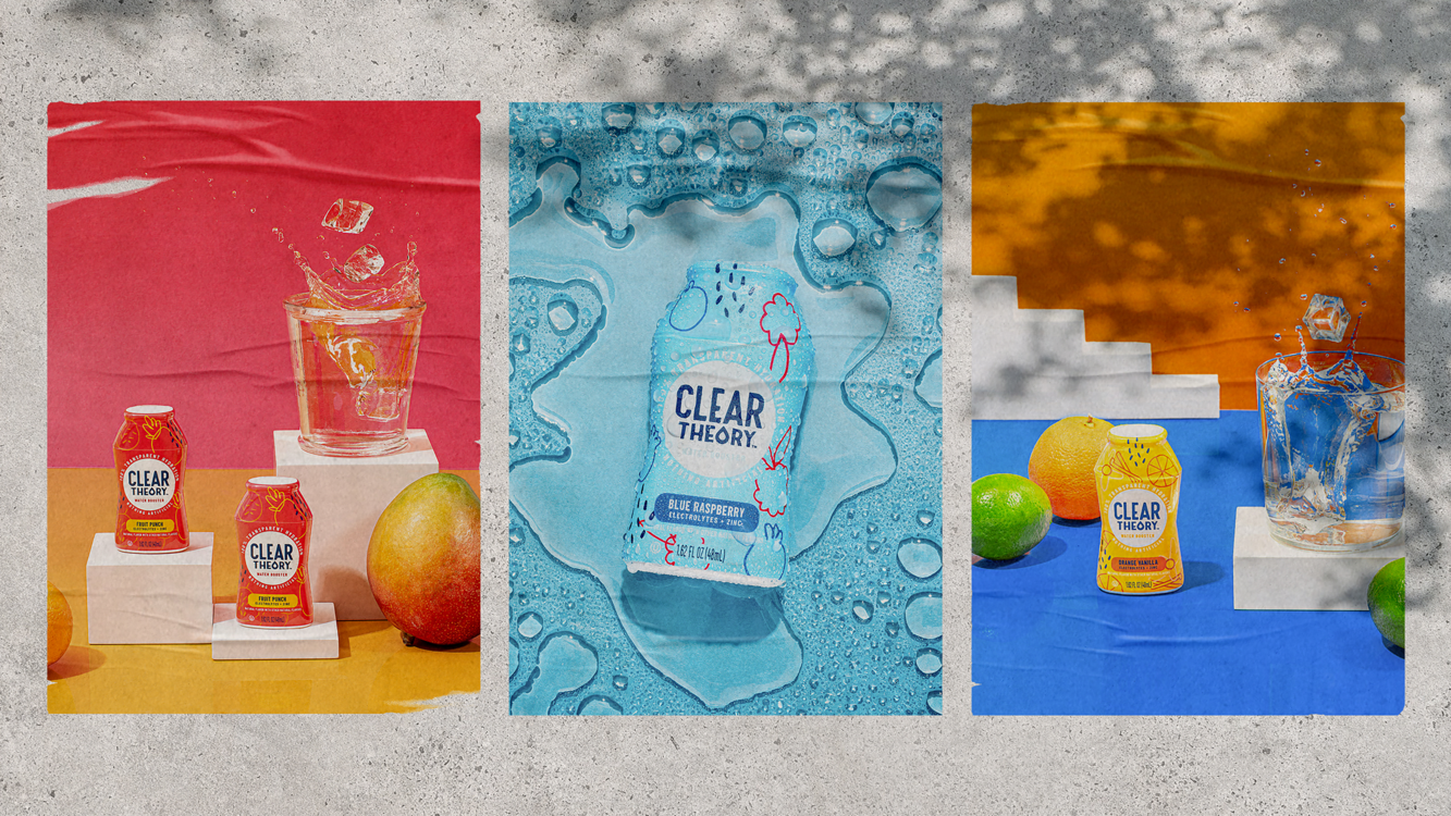
We helped Clear Theory enter the functional water enhancer space with a fun, vibrant brand design and captivating packaging.
Challenge
This emerging water enhancer needed to find their voice and compete on shelf with the big-brand market leaders- all packed with artificial flavors and performance enhancing functional attributes. They had uncovered a gap in the market for a “no added” player- with a clear product that doesn’t have added coloring or artificial ingredients- and needed help creating the brand name, identity, and visuals.
Insights & Strategy
Hydration is universal. But today’s modern consumer does not want to add a bunch of junk to their water just to make it palatable. Our approach was to clearly convey cleanliness and function by creating a modern brand that clearly stands apart from the rest of the category.
Solution
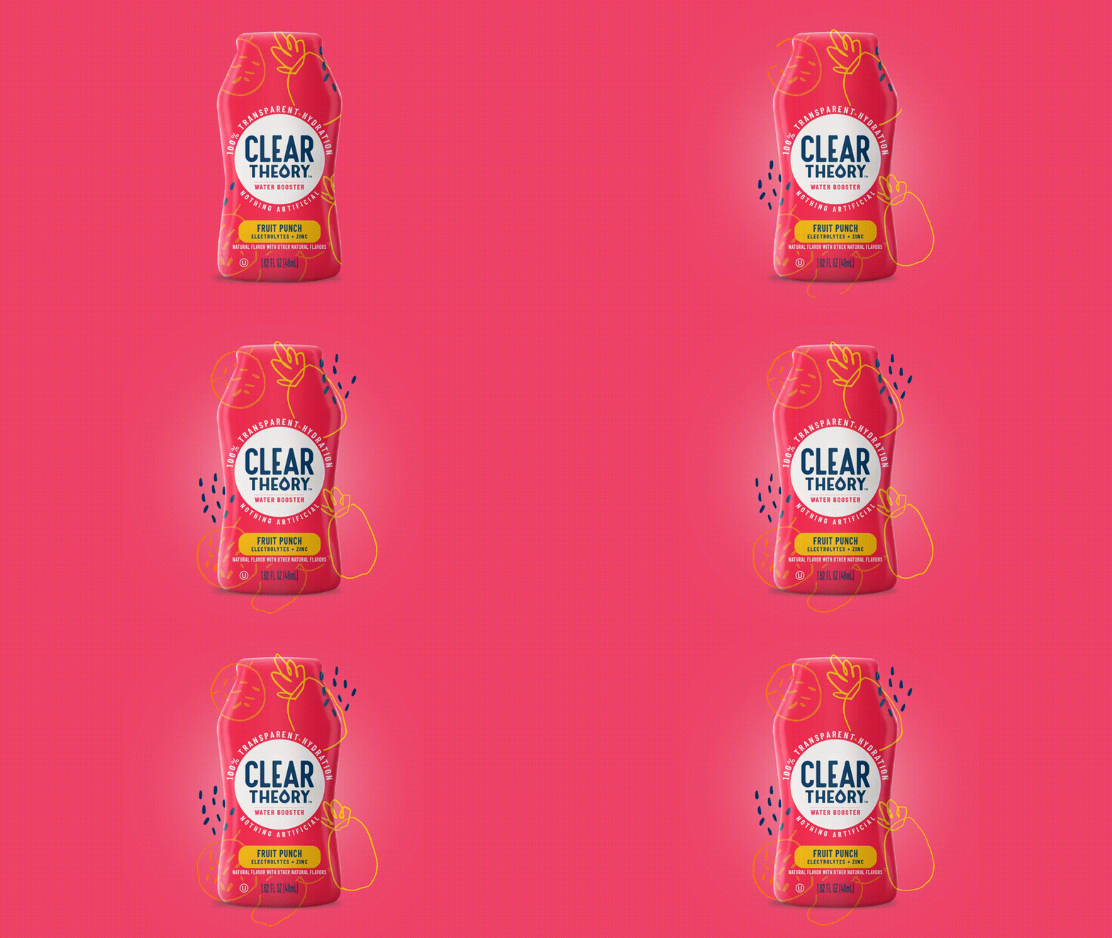
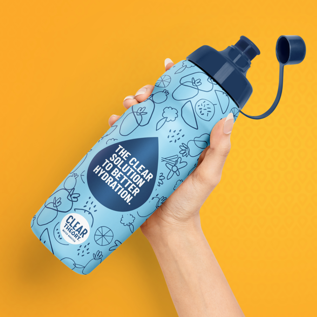
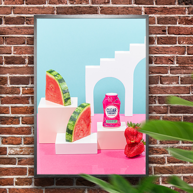
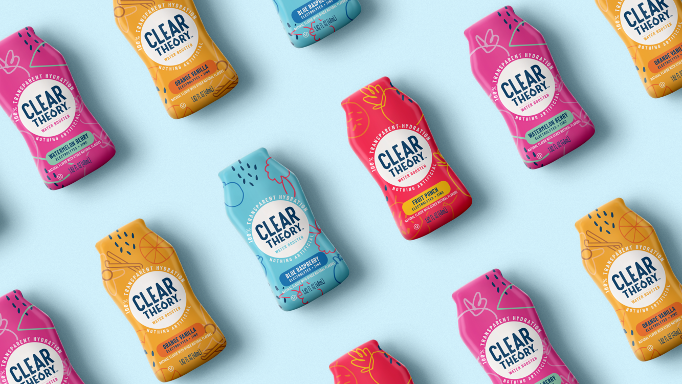
Clear Theory is the modern family’s solution to flavorful and functional water. The tiny package packs a big punch-with bold, vibrant colors and hand-drawn illustrations. Clear Theory looks nothing like their conventional competitors, carving a new space in a quiet category that was begging for innovation.
Clear Theory is the first functional, clean hydration for families on-the-go. Their message is clear: 100% transparent hydration.
Results
Our team’s role: brand strategy, naming, creative direction, logo and packaging design. Project executed while at The GRO Agency.