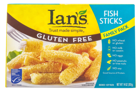
By leveraging the brand’s wholesome roots and changing the narrative to a more inclusive message, Ian’s became the frozen aisle’s most mouthwatering allergen-friendly comfort food.
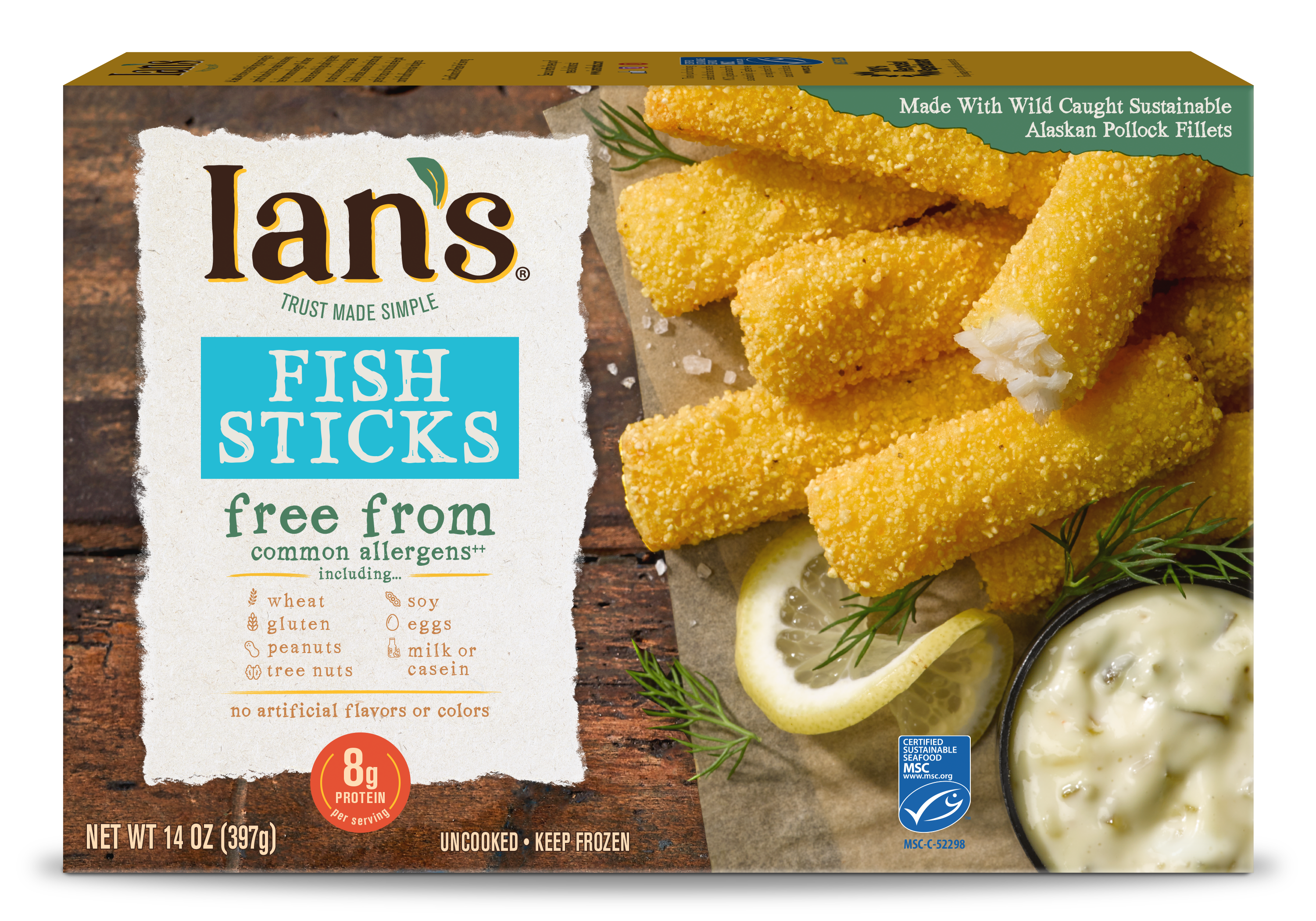
By leveraging the brand’s wholesome roots and changing the narrative to a more inclusive message, Ian’s became the frozen aisle’s most mouthwatering allergen-friendly comfort food.


Connect with us
"*" indicates required fields