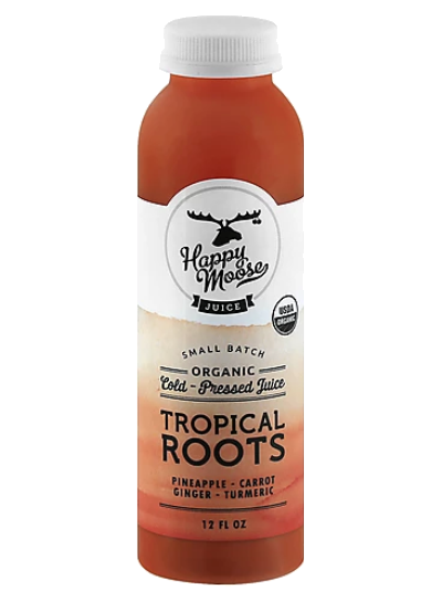
By looking for the unexpected creative spark that connects the brand to the consumer. Inspired by the good vibes of 70’s California, the new visual expression is a smile in a bottle.
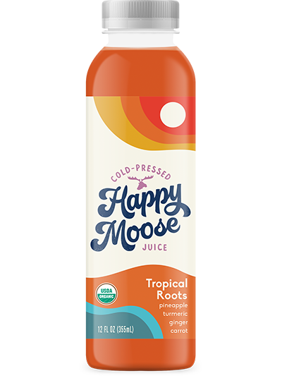
By looking for the unexpected creative spark that connects the brand to the consumer. Inspired by the good vibes of 70’s California, the new visual expression is a smile in a bottle.


Connect with us
"*" indicates required fields