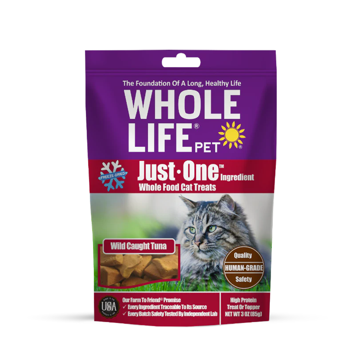
Rebranding can be tricky business. Many brands aren’t ready to let go of their current design, despite knowing it’s not working. Sometimes a brand needs a jumpstart with a complete visual overhaul. Whole Life’s founder, John, is different; he put complete trust into the process, and jumped head first to completely overhaul the branding and communication to better serve pet parents across the country. (Thank you for trusting us, John!)
We began by defining a dialed-in brand positioning and developing a clever, warm, and confident brand voice. We positioned Whole Life Pet as a trusted expert and friendly partner in pet care. This premium storytelling is woven throughout the brand, emphasizing commitment to in-house production, full traceability, and rigorous safety standards, all in the name of love for our pets.
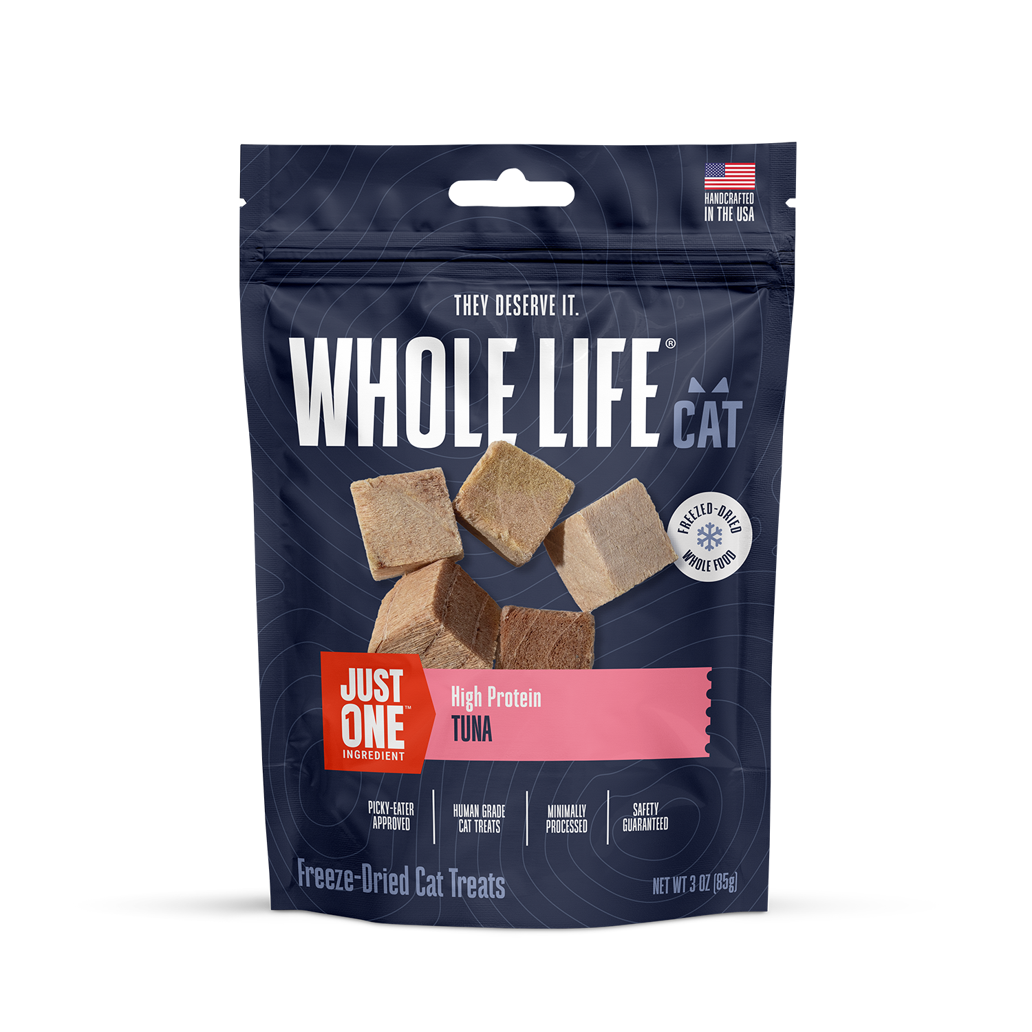
To reflect the shared knowledge that the needs of cats and dogs are vastly different, we separated the cat and dog lines both visually and in name—Whole Life Cat and Whole Life Dog. This distinction builds trust by showing we truly get the unique challenges of being a pet parent.
Next, we established a strong portfolio strategy executed across a flexible architecture that organizes SKUs by flavor, function, and format, making it easier for pet owners to navigate the product lines. No more scanning ingredients lists for food that won’t upset Fluffy’s stomach: everything is front and center – and easy to read.
Our visual overhaul began by replacing the dated “window” with bold, beautiful photography and tied it all together with clean typography and a modern color palette that signals quality. Each brand and product line features premium visuals that stand out from the competition, a clear communication hierarchy, and a cohesive brand world that resonates with pets’ specific quirks, needs, and personality traits, pulled together across packaging.
Born from the ashes of old packaging like a shelf-stable phoenix, our fresh identity allows Whole Life Pet to reposition itself without the baggage of the past.