img before
img after
Challenge

The spark that led Moji Okuyemi to found Pearl Honey Spreads came when her daughter (the aptly-named Pearl) kept asking for sugary jams to adorn her pancakes.

While looking for a healthy replacement, Moji found that almost everything on shelves contained artificial sugars, coloring, and preservatives. Moji created Pearl Honey to bridge the gap between delicious and healthy with a honey spread made from clean ingredients, organic spices, and an all-natural formula.

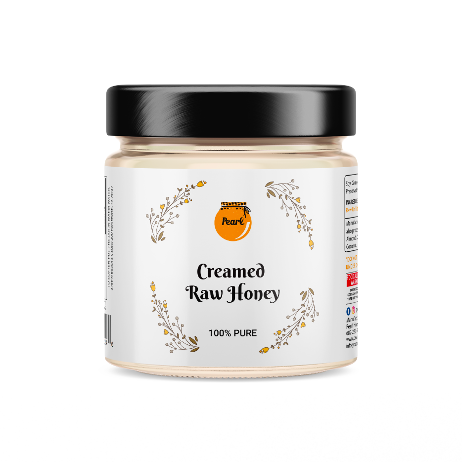
Her original packaging didn’t capture customers’ attention or clearly communicate what the product is or how it’s different. Pearl Honey’s strength lay in its premium ingredients, flavors, dairy-free, gluten-free, additive-free formula, and uniquely creamy, spreadable texture, but the brand needed a clearer way to communicate these benefits.

Scope

  • Brand Strategy & Positioning
  • Packaging Design
  • Website Design
Insights & Strategy

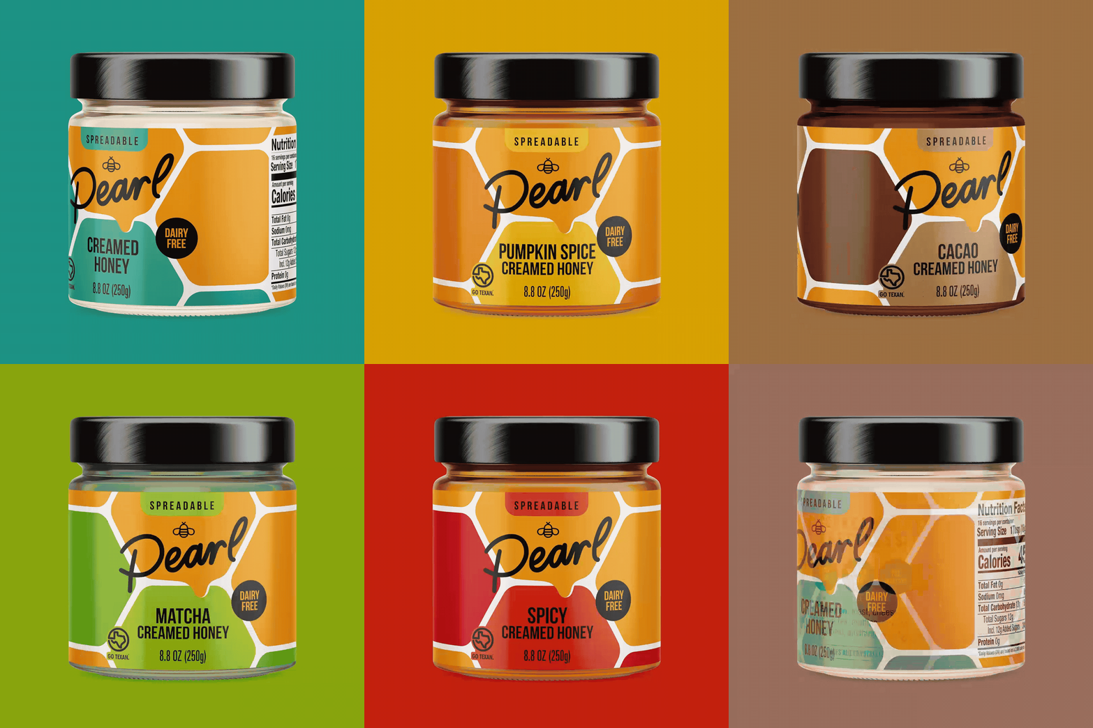
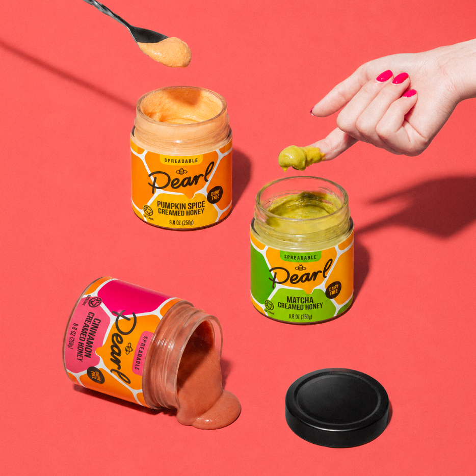
Today’s spreads don’t deliver the flavor, versatility, or wholesomeness kids deserve. We wanted Pearl Honey’s packaging to feel clean and fun – with obvious flavor differentiation – while clearly signaling “honey” to the shopper.

It was especially important to avoid anything that felt too processed or corporate while still conveying credibility and trust. We had to walk the line between approachability and refinement to build an emotional connection with consumers seeking a clean, delicious, minimally processed honey spread.

Solution

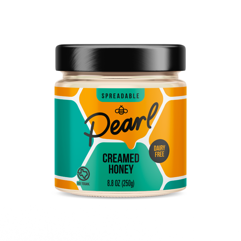
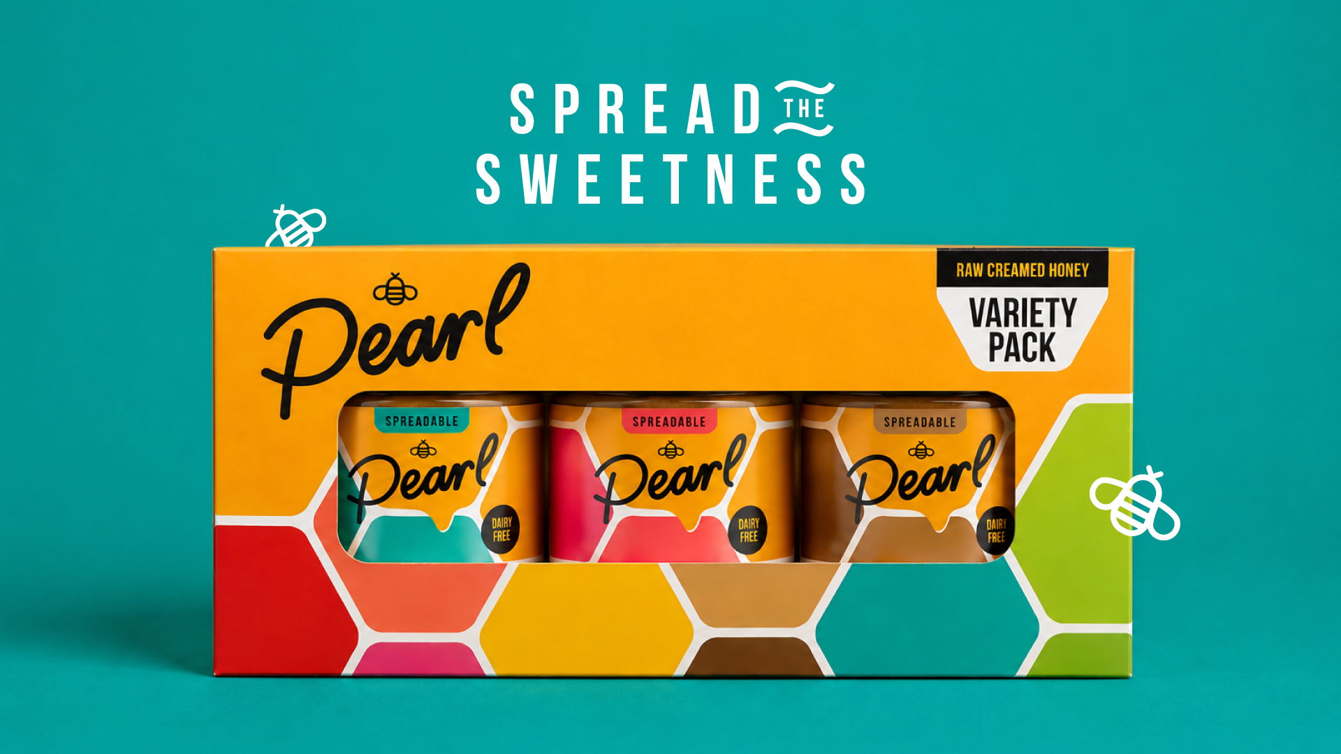
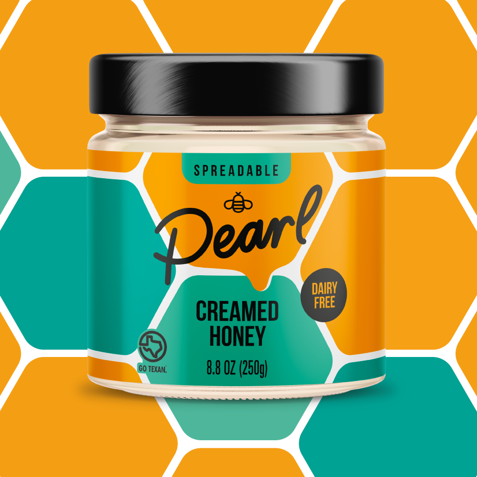
We helped Pearl Honey stand out with a modernized design that communicates the brand’s simple ingredients and indulgently creamy texture.

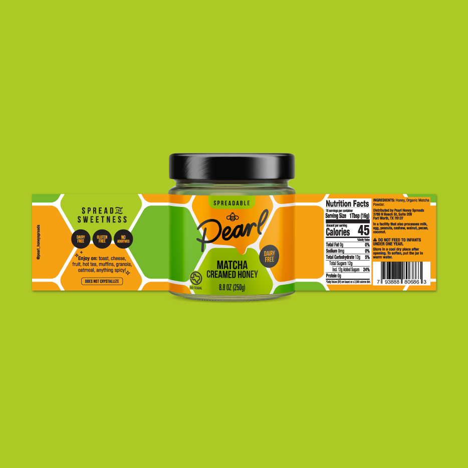
The packaging uses honey-inspired imagery in a fresh, non-traditional way, with thoughtful color choices to convey the product’s robust flavor and spreadable texture. Custom iconography identifies the category with a hand-drawn logo for an approachable, authentic look. With “spreadable” front-and-center, the consumer now understands the product usage quickly. Clear serving suggestions on both packaging and the website guide customers on the versatility of the delicious honey spread. And we never gloss over the founders’ story – and proud Texas roots – to build trust.

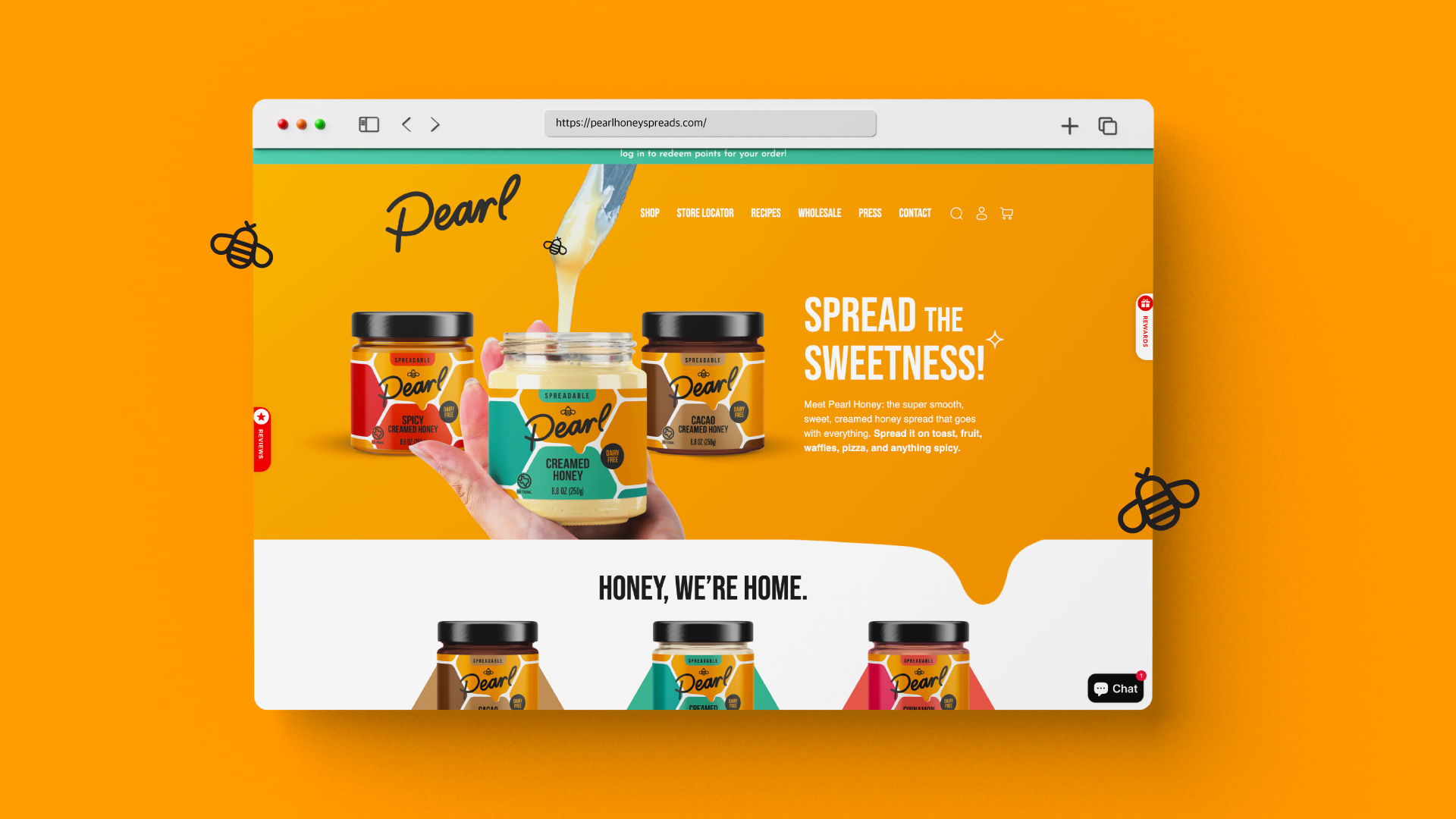
From there, we carried that same energy off the shelf and onto the web. Our website redesign laddered up to Pearl Honey’s broader brand strategy, extending the packaging’s modern identity into a fun, easy, visually appealing experience.

In keeping with Pearl Honey’s new vibe, the website embraces a sweet, contemporary aesthetic that reflects the product’s organic ingredients, wholesome look, and clean sourcing. We added headlines throughout the site to highlight the founder’s story, as well as Pearl Honey’s use of honey from local beehives in Texas. We also spotlighted the unique whipping process that gives Pearl Honey its buttery-smooth texture, while encouraging consumers to rethink how they enjoy honey with classic and unconventional pairing suggestions.

Results

Pearl Honey’s refresh transformed the brand from a niche honey product into a modern, versatile pantry staple built for today’s health-conscious families. By creating a cohesive visual identity across packaging and web, the brand was able to better communicate its clean ingredients, spreadable texture, and everyday versatility at every customer touchpoint.

Positioned as a premium, trustworthy, and emotionally resonant brand, Pearl Honey now looks and feels like the brand Moji set out to build for Pearl — one where a healthier honey spread doesn’t mean sacrificing an ounce of joy.

Connect with us

This site is protected by reCAPTCHA and the Google Privacy Policy and Terms of Service apply.

"*" indicates required fields