img
Challenge

Welcome to the Energy Drink Thunderdome where plant-based, super-functional, hyper-stylish, beverages enter a packed arena to engage in hand-to-hand combat with other brands for the illustrious title of: best dressed can in the refrigerated section.

As supermarkets and bodegas swell with drinks designed to optimize your performance, snagging the spotlight ultimately comes down an engaging *~vibe*~ that breaks the cycle of mediocrity and tells a story. Here’s Iba’s:

Iba was founded to fulfill the vision of its founder Flavia, of developing a reliable source of healthy energy inspired by the very best of Brazilian culture and the super-functional food loved by the people from her homeland.

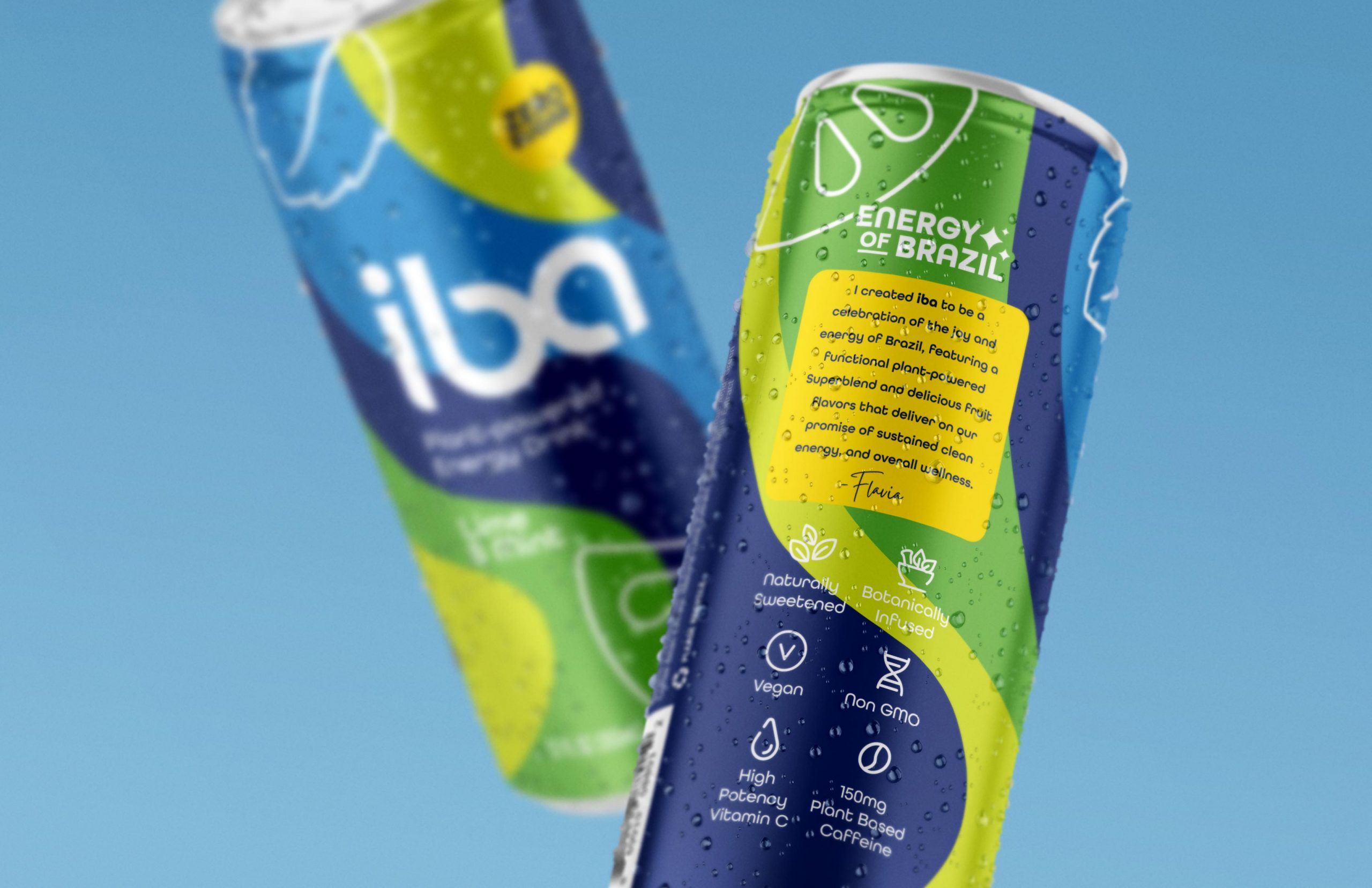
Made from a proprietary blend of guarana, green coffee beans, acerola, and copaiba, Iba is one of those rare functional beverages formulated to be drunk safely throughout the day.

For the looky-loos who may not know about Iba’s synergistic effect of sustained energy, immunity and overall wellness, getting its benefits and culture across meant digging deep. We immersed ourselves in the joyful spirit of Brazil, allowing its sounds, sights, and smells inspire an extensive, original visual language.

Insights & Strategy

Iba’s Brazilian roots paired with its founders’ vision leant authenticity, trust and credibility to the brand while cementing its mission of promoting a healthy, active lifestyle to the masses.

A competitor analysis of an extremely flooded market found a lot of the same: conventional design choices from conventional drinks. Most brands relied on a green leaf motif to communicate a “natural” sentiment, also using slash, burst, or blast imagery to visualize energy.

We knew to avoid some of the most overused colors (blacks, whites, greens, yellows, and purple) while embodying the joyfulness and strong, feminine energy of the brand.

For years, energy drink brands have had the reputation of sophomoric and crass – praying on male insecurities by upholding antiquated ideas of masculinity and power. Do we really need a 32-ounce aluminum can shaped like a radioactive missile? Nope.

While several competitors did include indigenous ingredients in their visual story, most approached culture in a stiff – detached – manner, banishing the consumer to the dusty outskirts of inclusivity.

What we had was a gaggle of claim-heavy, function-forward beverages devoid of personality or a unique POV. Jackpot. This gave us ample whitespace to explore a modern personality-driven design.

Solution

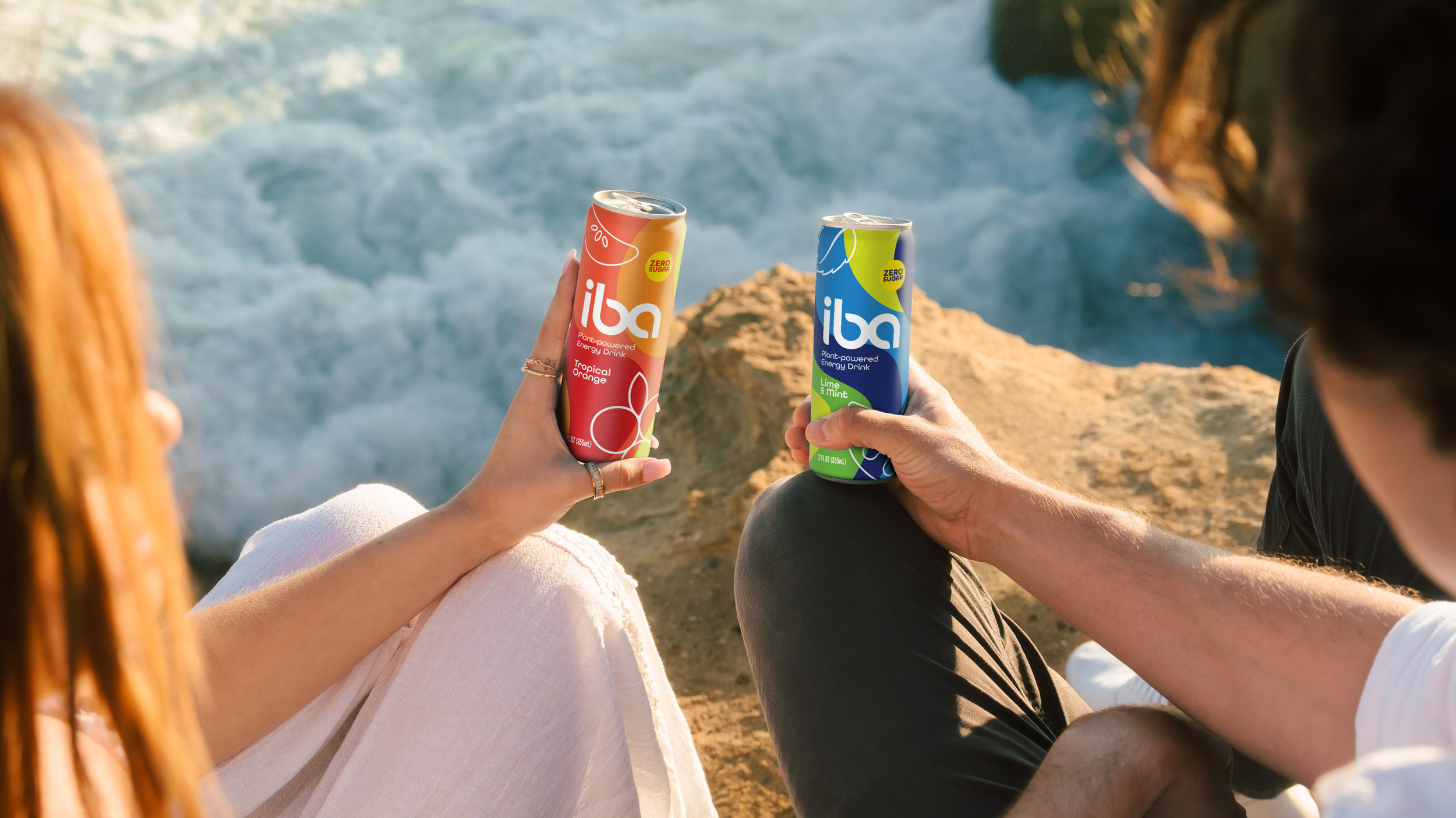
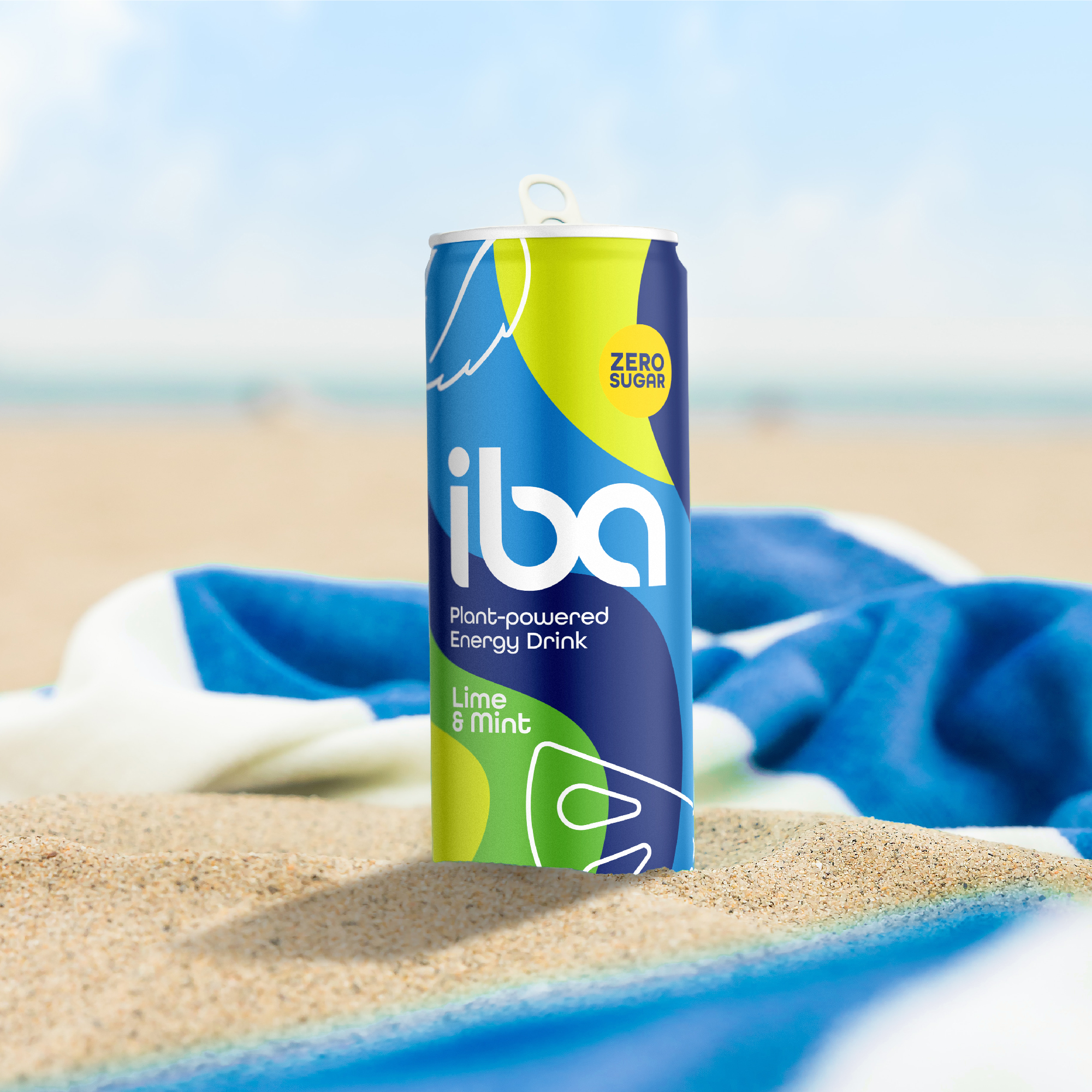
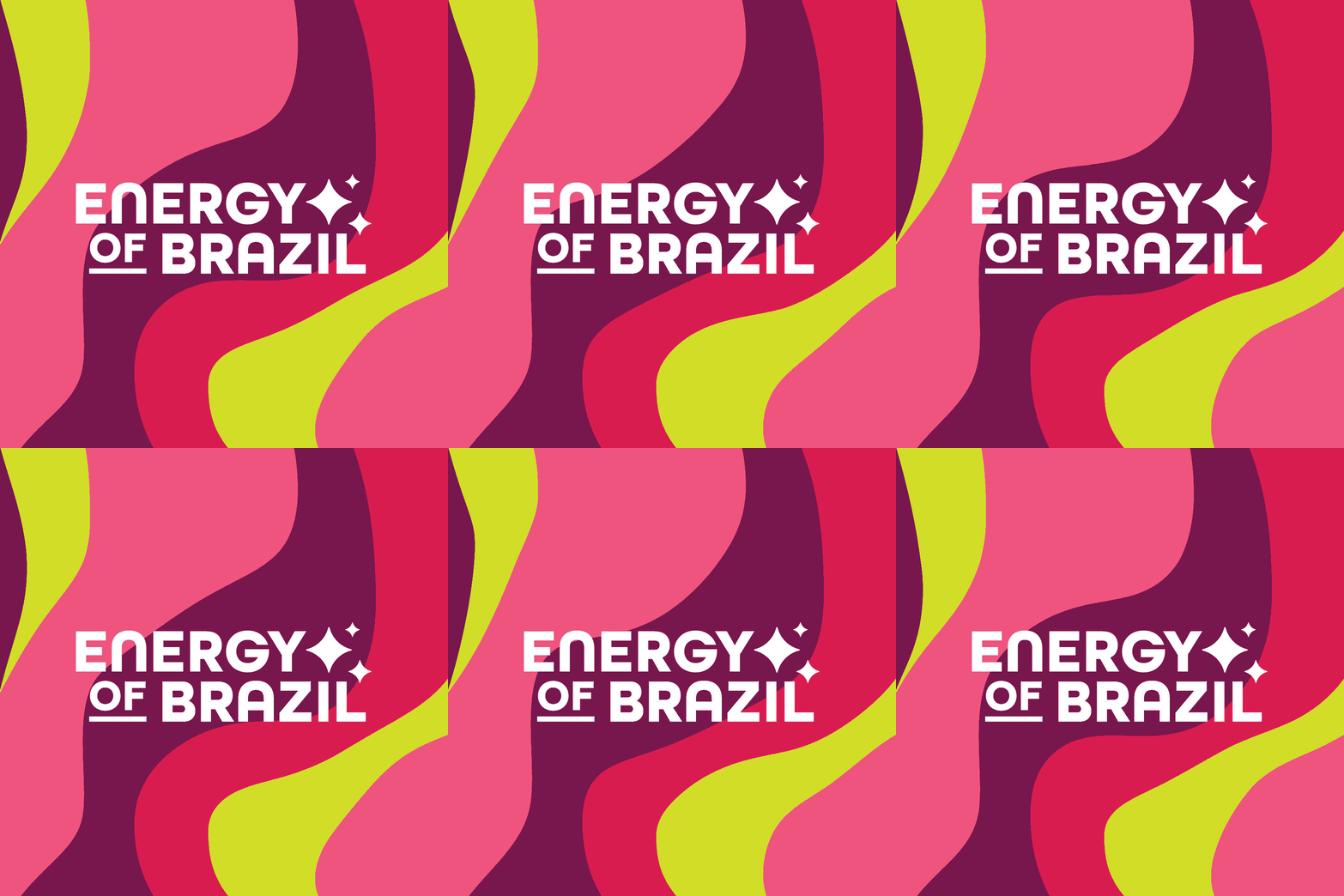
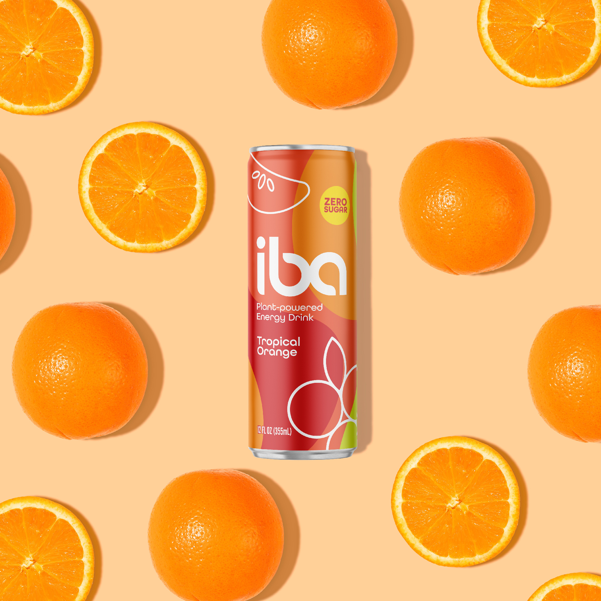
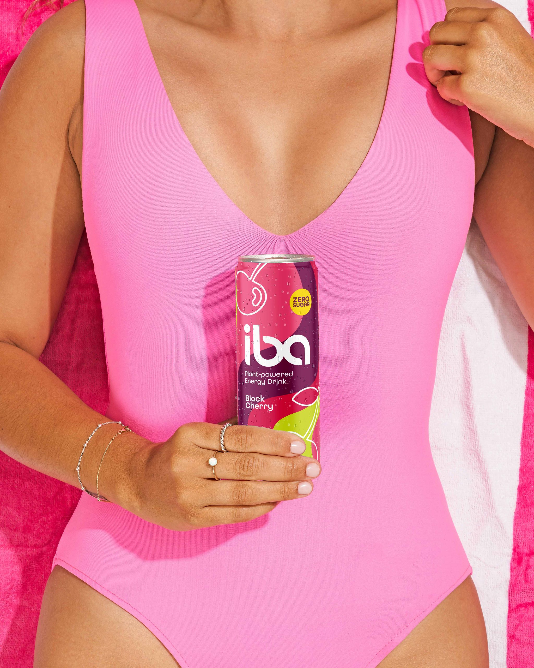
Inspired by the colors and hues consumers weren’t seeing on the shelves, we created three cohesive looks with clean gradients, bright colors, and Brazilian-inspired patterning to illustrate Iba’s rich personality.

Differentiating its functional formula from the macho energy brands named after weapons of mass destruction meant leaning on transparency to separate Iba from a category loaded with unpronounceable ingredients.

Results

Behold Iba! No chemicals. No GMOs. Just good, clean ingredients from the lands of Brazil.

Connect with us

This site is protected by reCAPTCHA and the Google Privacy Policy and Terms of Service apply.

"*" indicates required fields