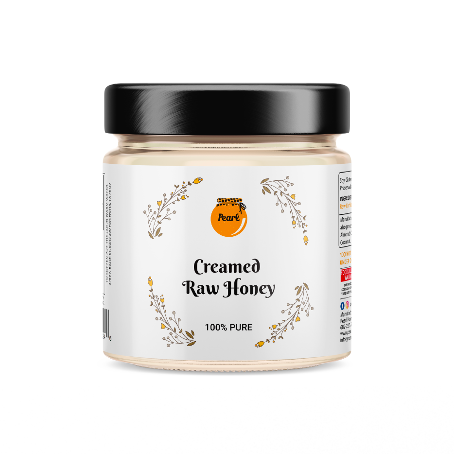
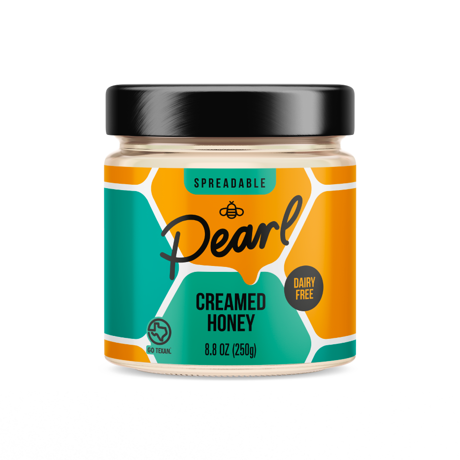
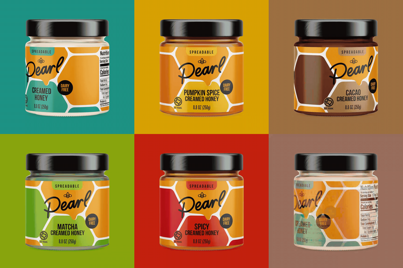
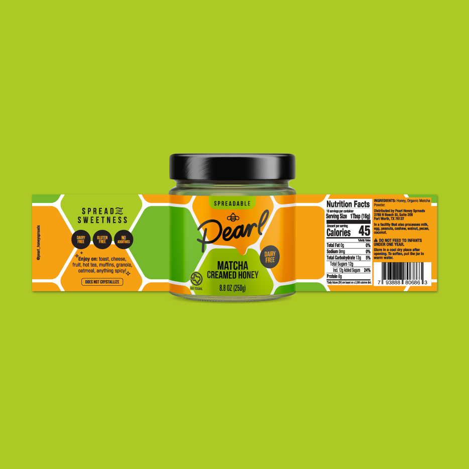
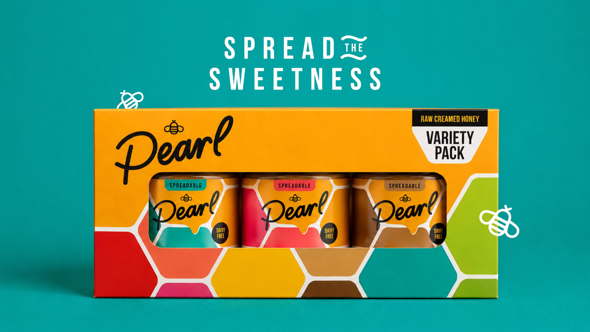
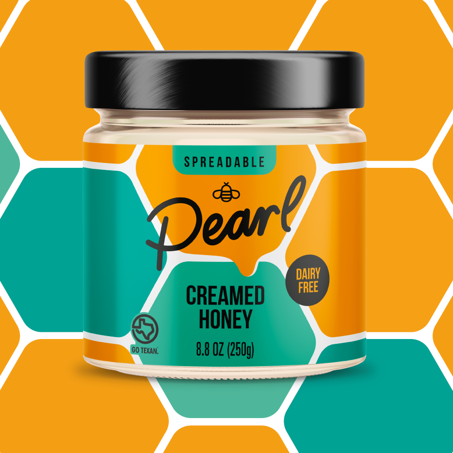
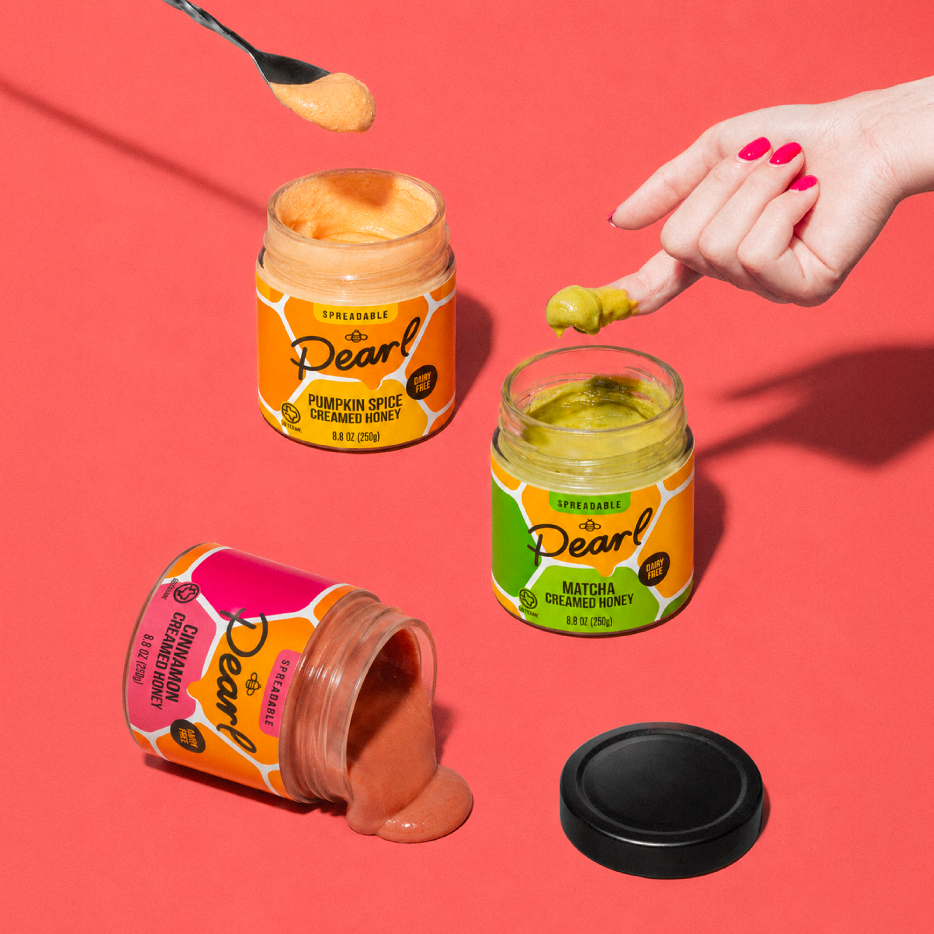
We helped Pearl Honey stand out with a modernized design that communicates the brand’s simple ingredients and indulgently creamy texture.
The packaging uses honey-inspired imagery in a fresh, non-traditional way, with thoughtful color choices to convey the product’s robust flavor and spreadable texture. Custom iconography identifies the category with a hand-drawn logo for an approachable, authentic look. With “spreadable” front-and-center, the consumer now understands the product usage quickly. Clear serving suggestions on both packaging and the website guide customers on the versatility of the delicious honey spread. And we never gloss over the founders’ story – and proud Texas roots – to build trust.
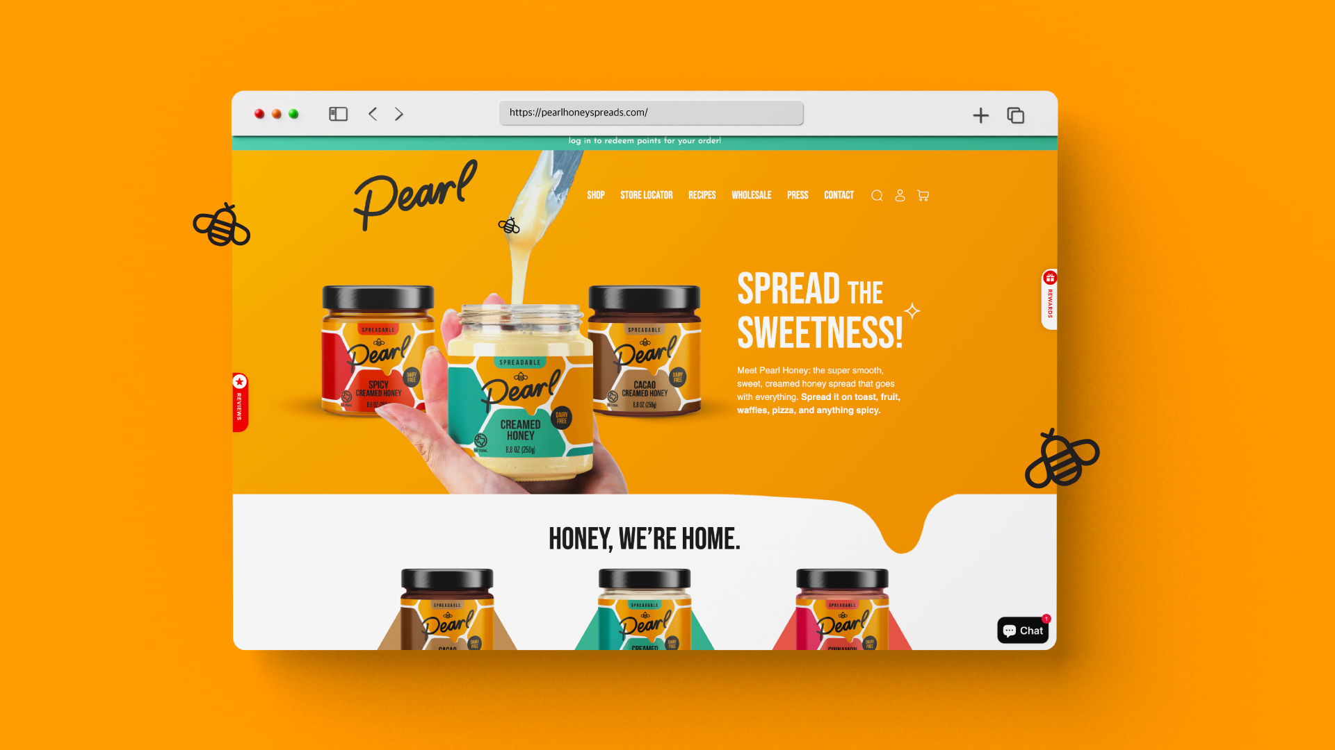
From there, we carried that same energy off the shelf and onto the web. Our website redesign laddered up to Pearl Honey’s broader brand strategy, extending the packaging’s modern identity into a fun, easy, visually appealing experience.
In keeping with Pearl Honey’s new vibe, the website embraces a sweet, contemporary aesthetic that reflects the product’s organic ingredients, wholesome look, and clean sourcing. We added headlines throughout the site to highlight the founder’s story, as well as Pearl Honey’s use of honey from local beehives in Texas. We also spotlighted the unique whipping process that gives Pearl Honey its buttery-smooth texture, while encouraging consumers to rethink how they enjoy honey with classic and unconventional pairing suggestions.