You did everything you should be doing — a sweet website, robust social copy, a clever mission statement, and a product people actually like. So why aren’t you seeing results? The lack of traction might be your packaging. From confusing messaging to the pitfalls of design saturation, knowing where to go next comes down to evaluating your approach.
You’re Blending In
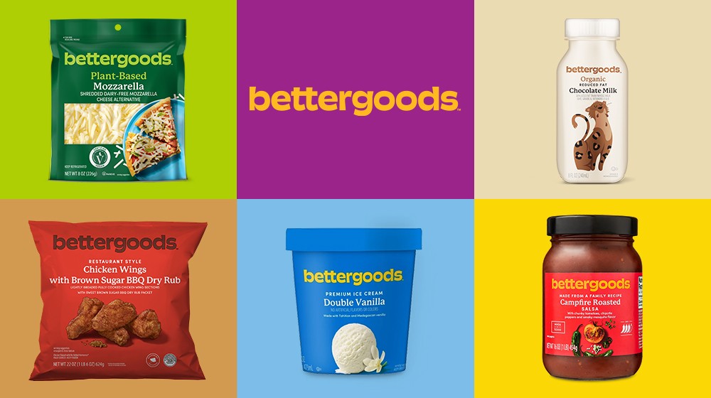
The journey from outlier to trendsetter to thought leader is easier to measure in hindsight. A trend’s downward spiral typically follows the design appropriation from a major brand (e.g., Walmart’s stripped-down, bettergoods brand) and hits morgue status shortly thereafter.

You’re Extending Your Reach
You cannot, should not, and can not design packaging that satisfies everyone. Not only are you headed towards the land of blandness, but this abandons a core rule in branding: speak to a niche audience.
You’re Saying Too Much
Show, don’t tell. In an age of radical transparency, it’s far too easy to fall into the trap of frontloading your packaging with every single claim and benefit that makes your product unique. Remember your audience – we are a culture of deeply distracted individuals whose eyes naturally skip over cluttered packages.
Focus, refine, and showcase the core trains that make your thing the only one worth picking up. Consider your brand’s extended universe for ancillary messaging; list your product’s allergy-friendly facilities on a website or social media channel, produce a video that invites viewers into your brand story, and practice the ideology of show, don’t tell.
Your Packaging Is Confusing
You’ve got moments to get your message across before the person in the supermarket is called away by a better deal or screaming child. Your packaging could have all the bells and whistles of an award-winning agency, but the mission is lost if you can’t understand what your product is and why it’s better in the nanoseconds it takes the electrons in our brains to send out zaps.
Speak to the common denominator and make choices that are grounded in design and strategy without burying the lede.
You Didn’t Do Any Foundational Work
Theoretically, anyone with a large enough bank account can shake up their pick of any supermarket aisle with a product that looks “pretty.”
Do the upfront work to figure out a unique point of view for your brand, or consumers will catch on quickly. It’s hard to resonate with customers without any strategy or backstory to make them feel like they’re part of your story. Pretty packaging can only go so far; context is king.
Launching a brand can, at times, feel like writing a book. The attention and focus on context, backstory, and reasoning must exist to carry the larger narrative displayed across packaging.
The “fun stuff” gets even more fun once you’re set up for success. Deaf ears sell no chips.
One of my all-time favorite scenes in cinema comes from Back to the Future when Marty McFly plays an impromptu cover of the song “Johnny B. Goode.” His execution is flawless and electric, ending the rock tune with the Van Halen-esque guitar shred that ultimately shocks the living shit out of an audience full of teenagers living in 1955.
The point is: no matter how much faith you have in your product, sometimes you gotta just read the room. Look at your packaging the way those teenagers looked at Marty McFly channeling a style of music decades away from his audience’s expectations.
If you suspect your packaging may be the problem, drop us a line, and we’ll figure out how to take your product to the next level. If my calculations are correct, when this baby hits 88 miles per hour, you’re going to see some serious shit.
Check out our Food & Bev Brand Bootcamp for all your DIY branding needs.

