img
Challenge

The marriage of mushrooms to munchies has grown into a fruitful relationship in the CPG arena, garnering the attention of fungi-curious adults and normies who desire a functional supplement they can sink their teeth into.

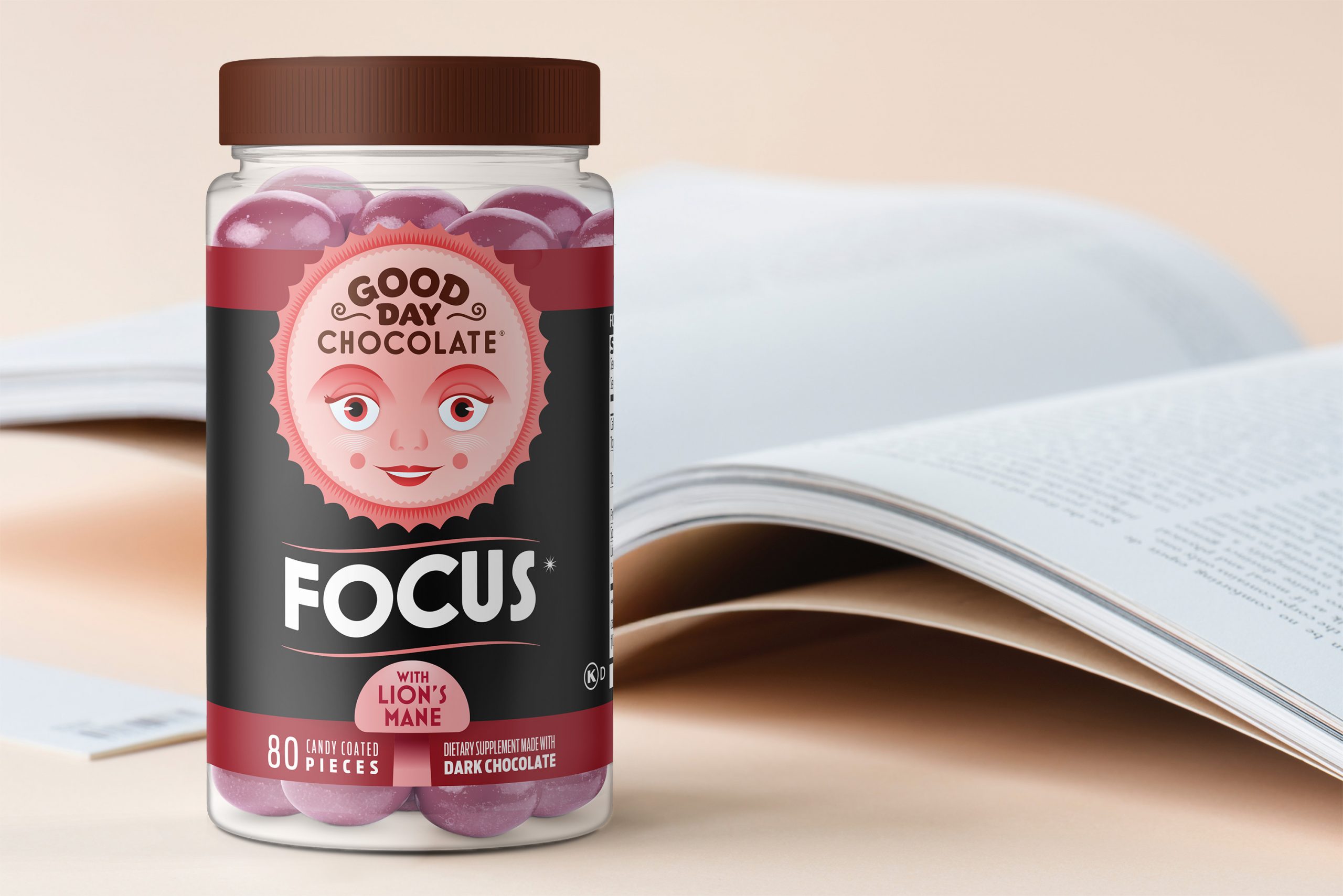
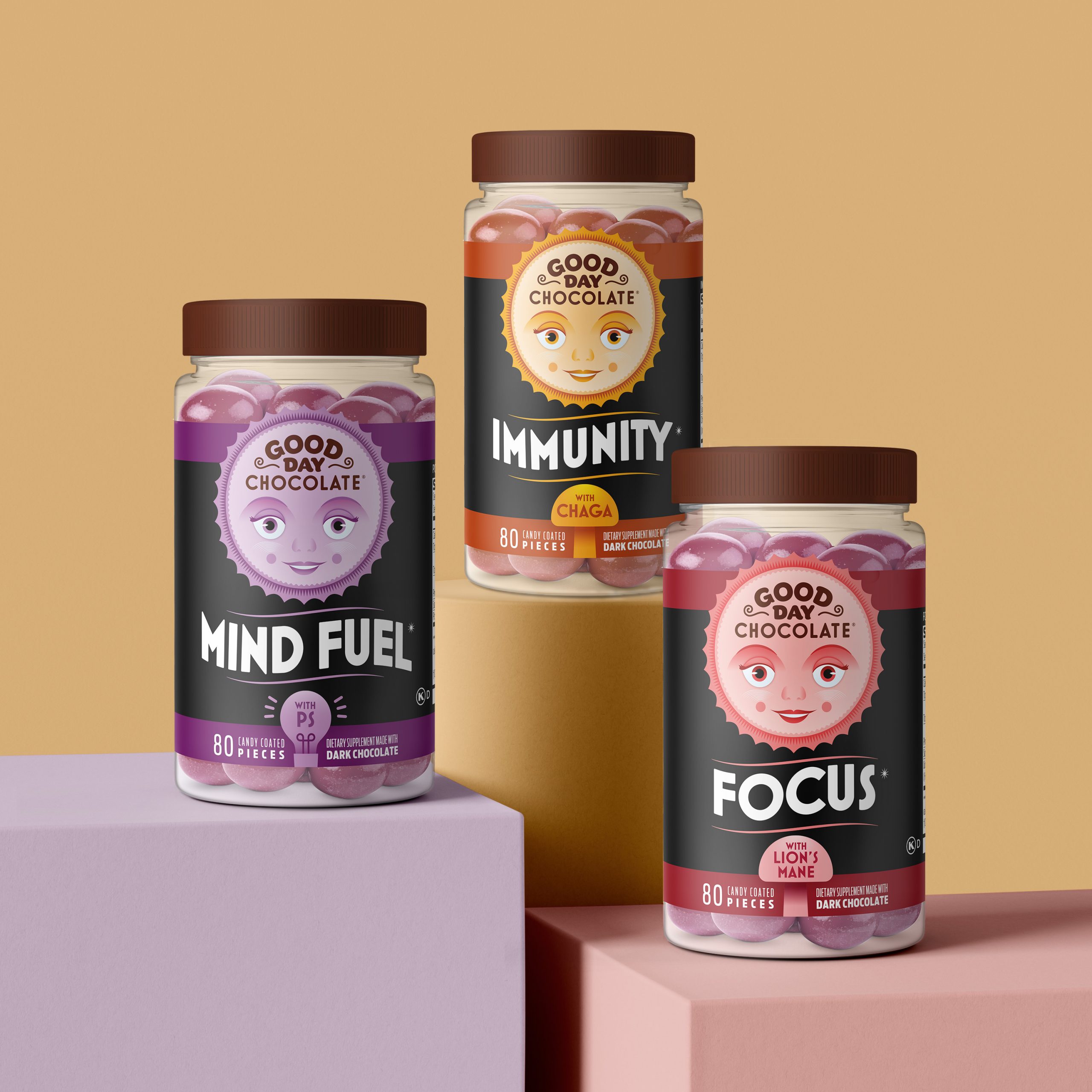
Good Day Chocolate emerged as a sweet supplement brand in 2012, delivering ingredients like magnesium, chamomile, and L-Theanine within a delicious chocolate drop. More than a decade later, they’ve expanded their reach with their mushroom-powered supplements: Think, Focus, and Immunity.

Mudge helped then create this distinct new line and redesigned their iconic mascot in the process.

Here’s how we made it happen.

Insights & Strategy

A walk down the supplement aisle has turned into a circus. Consumers are hit from all sides with brightly-colored tins, boxes, and pouches all promising something more. What that “more” actually “is” keeps getting lost in crowded packaging, overshadowing the product’s actual benefits

We began with a function-first approach to differentiate Good Day Chocolate, we positioned the benefits as the hero while making the mushrooms a secondary visual element.

Another issue was shopability; variations within the Good Day Portfolio were difficult to distinguish at a glance, making it harder for consumers to find the product they needed quickly.

Also, there was the issue of GDC’s adult SKUs coming across as too youthful in their design, which likely impacted their relevance to the target audience.

Solution

To enhance shelf presence in a supplement market growing faster than tiny spores germinating into a network of thread-like structures, we developed a bold new color palette that sets the product apart from like-minded brands and establishes the line as adult.

We also carefully refined the design to create an intuitive differentiation system between SKUs, making it easier for consumers to navigate the line and identify the right option for their needs.

We fixed that by giving the logo a grown-up glow-up that skews more towards wellness than wacky.

Beyond aesthetics, our team streamlined the communication on the packaging after finding that redundant claims diluted the impact of the most essential messaging.

Results

By refining the hierarchy of information and simplifying the visual elements, we created a cleaner, more compelling packaging system that improves shelf impact, enhances differentiation, and aligns better with consumer expectations.

Connect with us

This site is protected by reCAPTCHA and the Google Privacy Policy and Terms of Service apply.

"*" indicates required fields