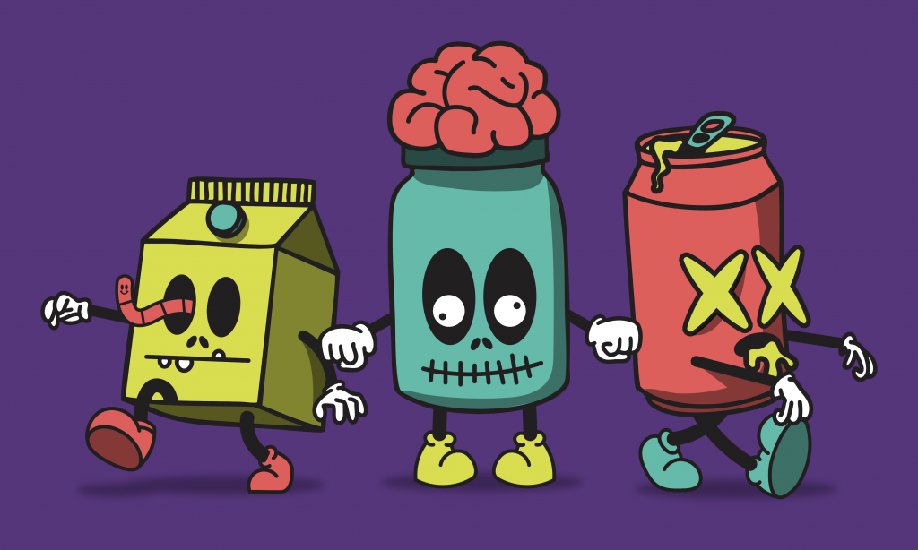
They lurk in the shadowy depths of supermarkets, just waiting to grab an unassuming shopper’s attention through the garbled moans of prehistoric packaging: HAUNTED BRANDS.
Possessed by the malevolent spirit of their former selves, these ghoulish goods shuffle the stores with dusty logos, dated taglines, and design choices that have escaped the comfy confines of six feet underground.
A brand exorcism is about banishing the things that haunt your brand: outdated positioning that no longer fits, packaging that confuses more than it convinces, and copy written so many brand managers ago it’s practically ancient lore. For snacks that need their souls purged of the past, a piping hot exorcism might be the key to breaking out of brand purgatory. (No knowledge of Latin required!)
Channel the Spirits
Before you send any lingering spirit back to the land of pearly gates, endless buffets, and 24/7 Chuck Mangione, you first need to find out what’s possessing your brand.
Kick things off with a mini-audit: scan the competitive landscape, review your shelf presence, and get the consumer’s point of view. Whether that means testing with your current audience or tapping into the sweet, juicy brains of non-users through a platform like 1Q.com; the deeper you dig, the closer you’ll get to unearthing the malevolent forces shaping your brand’s perception.
Ask the hard questions: What do people actually think you are? Who are they comparing you to? What are they clicking, buying, or ignoring altogether? Keep in mind: just because a tagline killed it in 2017 doesn’t mean it still resonates with the same audience today.
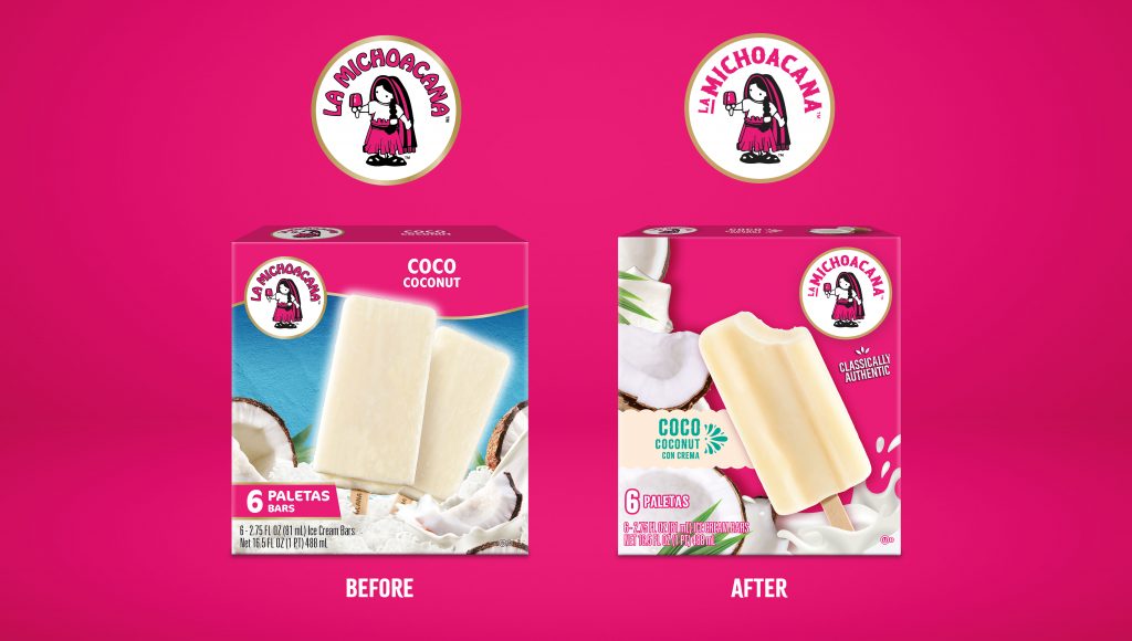
Mudge put this process into action with La Michoacana, a beloved frozen treat brand whose packaging hadn’t kept pace with newer competitors in the freezer aisle. Through deep consumer research, we dug up the brand’s most resonant elements (its iconic pink color, vibrant fruit imagery, and the La Niña mascot) and used them as the foundation for a modern refresh.
The resurrection didn’t just honor La Michoacana’s heritage, but gave the brand a fresh injection of LIFE that sparked stronger purchase intent and brighter perception.

Smoke Out the Ghost
Now, we get to flip on the lights and look for cobwebs. Start cataloging the outdated artifacts like logos or colors, that feel stuck in another decade. Nix descriptions that read like Dr. Frankenstein’s SKU codes and check your messaging for a pulse.
Clear off your operating table and lay it all out there: scrutinize the contradictions, anachronisms, and missteps that have become impossible to ignore. Now, it’s time to roll up your sleeves, wash your hands, and don the latex gloves. This is where you decide what’s worth saving and what goes into the choppin’ block. For instance, if you’re claiming “all natural” next to an AI product shot, send it out back for a quick and painless demise.
A blunt SWOT analysis always helps identify your next steps without sugarcoating strengths or overinflating opportunities. Once you can clearly identify what’s working and what’s not, you can decide whether to refine, retire, or replace.
Banish the Demons
A brand exorcism doesn’t mean torching everything and starting from scratch. Think scalpel, not chainsaw. Start with what creates clarity fastest: trim the SKUs that confuse shoppers, tighten copy that meanders, and strip any packaging elements that dilute the core message.
Some changes feel bold without being reckless: rename a couple of products so they’re less “inside joke,” rework your hierarchy so the consumer understands quickly what your product is, what it does, and why they want it. The brand should still have personality; you just make sure it’s speaking in complete sentences and not loaded with cringe.
RxBar stripped away the clutter and leaned into brutal simplicity, printing its ingredients right on the front of the pack (“3 Egg Whites, 6 Almonds, 4 Cashews, 2 Dates, No B.S.”), which instantly communicated transparency and trust in a crowded market. LaCroix went the other way by amplifying personality with bold color blocking and playful typography that broke from the sterile aesthetic of sparkling water with packaging that screeches: “AHHHHH! This tastes like smelling your favorite fruit in a dream.”
Cleanse the Spirit
Once the smoke clears and the shadows recede, it’s time to invite something brighter in. Distill your brand’s soul into a single, hauntingly simple truth: who you serve, what you stand for, and the feeling you want to leave lingering long after the first encounter.
Then, let everything reflect that core truth: packaging, messaging, and social media. Set a vibe that’s sensory, authentic, and leaves people curious for round two, then toss it headfirst into the wild with quick-turn shelf tests, small market launches, and digital pilots to see if it wins hearts and carts.
Mudge Tip: Sometimes evolution beats revolution. Incremental, confident moves make brand loyalists feel safe and secure, while helping new fans engage to their heart’s content.
