In case you haven’t noticed, Mudge is the type of food & branding agency that takes pride in creating disruptive work that wakes people out of their chronic aisle fatigue.
When designing for big box retailers, success comes from mastering – not defying – the type of tight constraints that get shoppers (and buyers) hungry.
The club store environment is a different kind of monster that demands both bold decisions and strategic design thinking. This means fewer SKUs, larger packaging, and a shopper mindset driven by value, speed, and discovery.
We’ve partnered with brands across categories and packaging formats to crack the ‘Costco code’—from freezer doors stocked to the gills with Helados Mexico, to bag-in-tray setups for Sunny Fruit and Simply Fuel.
Designing for big box stores requires a special set of skills (not unlike Liam Neeson in Taken) to create packaging that not only shows up on the shelf, but also stands out. Here are some of the best practices we’ve collected along the way for thinking inside the big box.
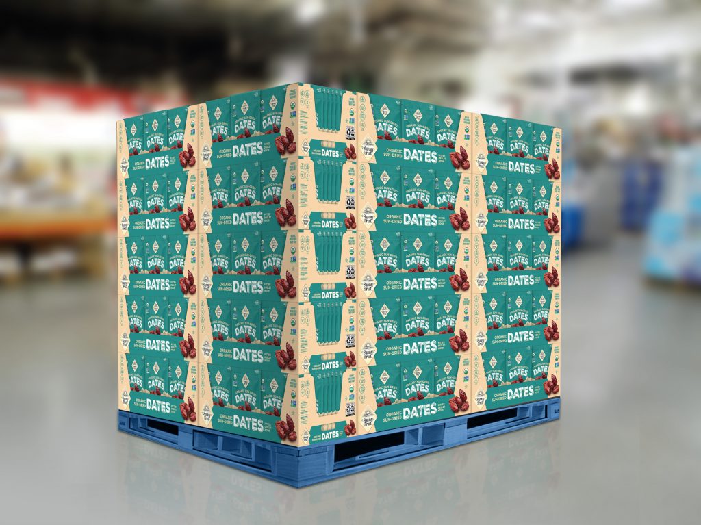
Think Like a Billboard
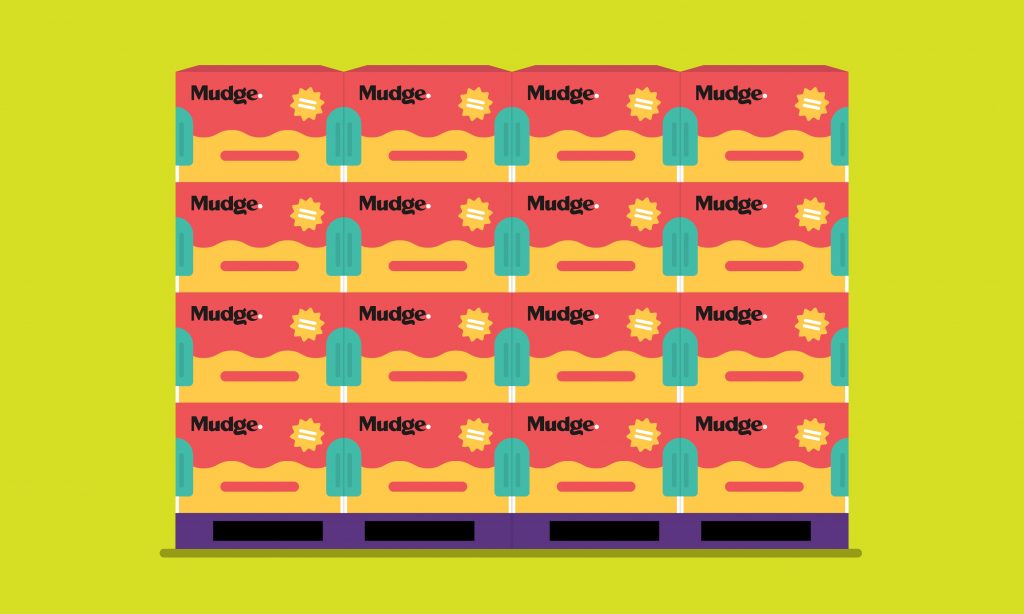
If you’ve ever been to Costco, Sam’s Club, or BJ’s (and I’m sure you have), it’s clear that merchandising is based on high-volume, pallet-based displays. Products are often presented in stacks or multi-unit blocks, creating a powerful opportunity for “billboarding,” in which packaging graphics align across the front of pack for larger-than-life branding.
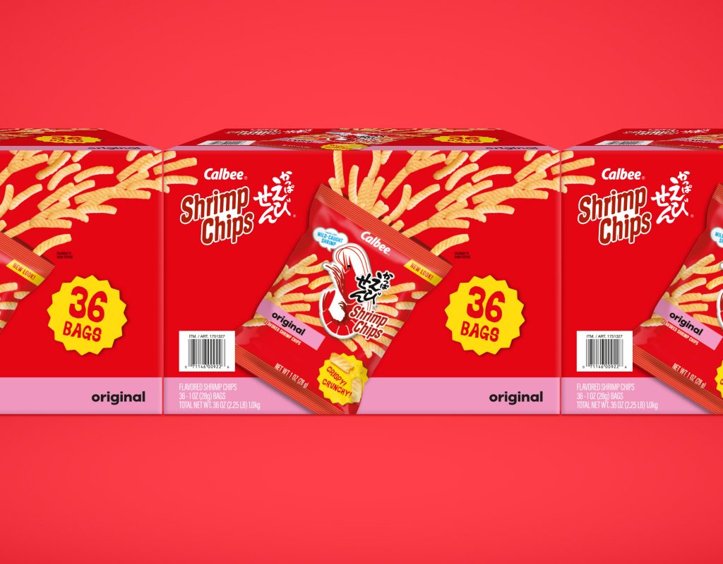
In an environment where shoppers process visual information from a further distance away than in a supermarket, high-impact graphics help attract attention at that scale. Our design for Calbee Shrimp Chips uses bold side and top panel graphics that align when stacked, turning every display into a branded wall. The product becomes the signage—no extra assets needed.
Bold, Simple, Instant
In a big-box store, cluttered packaging equals lost appeal. Shoppers are scanning aisles quickly, often with a gaggle of screaming kids in tow. That means your pack has seconds to grab attention. Bold color blocking, straightforward typography, and restrained messaging create clarity from a distance.
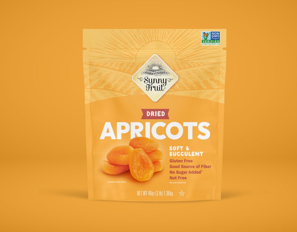
Visual simplicity often correlates with conversion as shoppers generally make purchase decisions without stopping their carts. Our work for Sunny Fruit utilizes rich, saturated colors and spacious compositions to cut through the visual noise. Clean design communicates health and quality at a glance—no squinting required.
Format Familiarity: Make the Structure Work
Bag-in-box and bag-in-tray formats can feel unfamiliar if not communicated clearly. And in a self-serve warehouse format, there’s no associate to explain what’s inside. Use photography, quantity callouts, and visual storytelling to demystify the pack structure.
Club store shoppers prefer packaging that shows them exactly what they’re getting inside to cut down on surprises or ambiguity. These shoppers are often bringing home bulk items for their kids, who, as all parents know, do not take kindly to being hoodwinked.
With Calbee Shrimp Chips’ variety pack, we showed all three flavor pouches right on the front panel, making it obvious what’s inside. Simple, visual, and trust-building.
Appetite Appeal Wins
Showcasing the product is one thing, but giving people a taste of the experience matters more. Research by Nielsen found that 64% of consumers are more likely to try a new product if the packaging catches their eye – that’s where high-quality food photography comes in.
Lead with photography that evokes flavor, texture, and satisfaction. Appetite appeal creates desire, even in bulk.
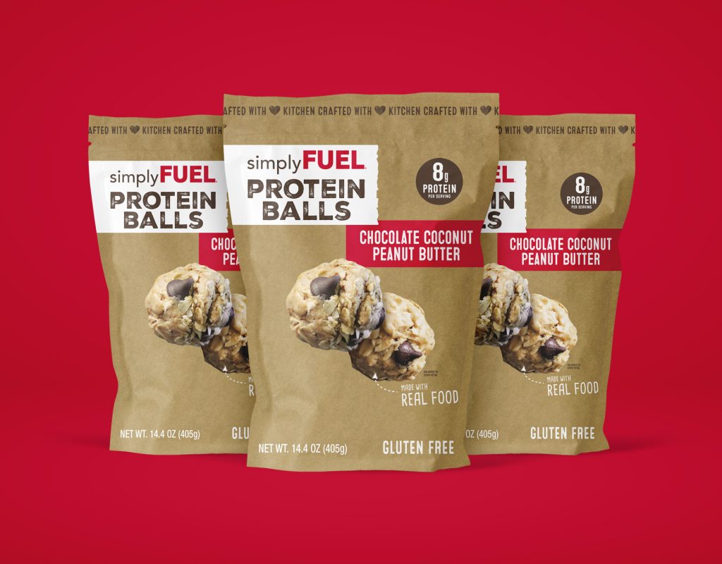
For Simply Fuel, we used vibrant, delectable photography of their protein balls, opting for appetite appeal over sterile pouch shots. Helados Mexico showcases vibrant paletas in all their fruity, frozen glory, capturing the attention of both brand followers and first-time buyers.
Tray + Pack = Unified System
When it comes to bag-in-tray formats, the outer tray isn’t just a place for the bags to sit – it’s part of your billboard. Treat it as an extension of the pack, not an afterthought. Colors, claims, and branding should work seamlessly across both components.
In our work with Sunny Fruit, we developed a color and type system that visually unified the tray and pouch. The tray highlights key selling points without overwhelming the pack design, creating a polished and consistent presence in the aisle.
Design for the Shelf, Not in a Vacuum
No package is an island. What you’re bringing to a big box store will compete for attention against household names (e.g. Costco’s private label juggernaut, Kirkland Signature) and must be strategically differentiated with color, voice, and value messaging.
Balancing perceived quality with clear value is key. You’re not just selling a product—you’re selling the idea that this is the wise choice right freaking now!
Make Value Obvious
Bulk shoppers don’t want to hunt for value—they want to see it. Use large callouts, weight specifications, and quantity indicators to clearly outline the offer. When in doubt, over-communicate.
Club store shoppers are more likely to purchase items that use visual quantity cues. For example:
- 36 Individually Wrapped Snacks!
- 3lb Value Pack!
- 10,000 Gummy Bears Inside!
Co-Create with the Buyer
Costco can feel like one of those cults that don’t always feel like a cult… like Soul Cycle or Erewhon. While they may not realize it, these buyers can start to develop an expertise in knowing what works and what doesn’t.
Engage them early in the design process with two to three fully considered directions. This not only invites better feedback but also increases internal alignment and your chances of landing in the rotation.
When a buyer feels included in the process, they advocate harder for it during the shelf reset season.
It’s a subtle shift that can unlock real momentum.
Don’t Just Scale. Rethink.
Designing for big box stores isn’t just about blowing up your retail pack, but rather about adapting to the unique rhythms of the club store experience. One must always consider how people move, browse, think, and ultimately purchase in an environment designed for efficiency and impact.
At Mudge, we’ve helped brands, large and small, translate their identity into packaging systems that sell—at a distance, at scale, and at speed. From freezer doors to floor stacks, we bring bold ideas and bulletproof execution to every aisle.